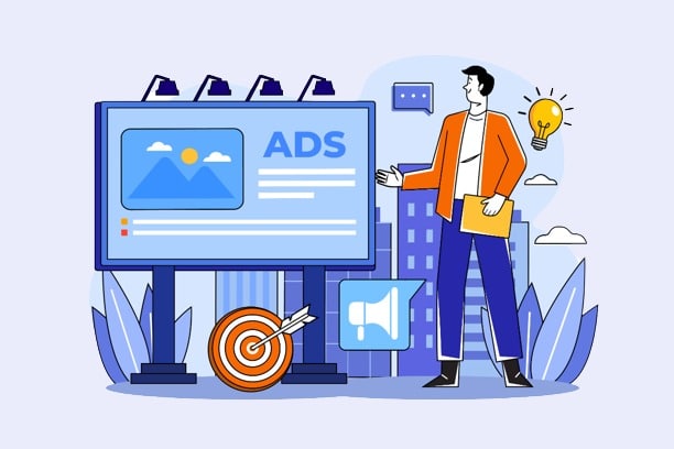
Looking for a marketing tool that stands out from the crowd? No need to look far. Banner ads are solutions that come in a variety of shapes and colors to help you get the most clicks for your ads. They come in the form of images that contain links and redirect to a specific brand's website. Today, many companies make use of web banners because they are measurable, effective and inexpensive. However, it is important to point out that the performance of this solution is closely related to its creation. How to get a quality website banner for the web? Appropriate formats, positioning, choice of colors, relevance, let's discover together the different tips to put into practice.
The appropriate format for your banner
The success of your online banner depends on a number of important elements. To begin with, you need to pay attention to the right size for your creation. According to Google AdSense, there are classic sizes that guarantee effectiveness. These include: large rectangle (336 x 280 pixels), medium rectangle (300 x 250 pixels), half page (300 x 600 pixels) and header (728 x 90 pixels). These are all configurations that you should choose.
Next, you need to think about which file formats are compatible with your advertising operation. In order to be on the safe side, you should opt for elements such as HTML5, GIF, JPG or PNG. If you have the skills to manipulate tools such as Photoshop and Adobe Illustrator, you will be able to modify your images and obtain GIF, PNG and JPG files. On the other hand, if you are proficient in Adobe Animate and Google Web Designer, you will get HTML5 files. Keep in mind that Flash ads are obsolete. Therefore, you should definitely opt for the image formats mentioned here to have a clean and nice visual output. Otherwise, you may suffer the consequences.
Finally, to have a web banner that meets your expectations and those of the internet, you must choose the smallest files possible. According to Google Adsthe accepted size is 150 Kb maximum. This value ensures that your banner will load quickly before visitors scroll down your page and lose sight of the ad set up to incite them to action.
The best positioning for your advertising tool
It is important to give your advertising tool the best location possible. To achieve this, you must respect the hierarchy and choose the best spaces to put your banners. Here are some tips to consider.

The hierarchy
The aesthetics of online banner ads is conditioned by the hierarchical balance. The quality of a brand's design is the ease of recognition by visitors. To ensure that your tool brings the desired effect, you should install your brand logo. This action will have an immediate impact on the popularity of your brand. When creating your banner, you need to make sure that the logo is prominent without reducing the visibility of the value proposition and the CTA (Call to Action).
Next, you need to think about the value proposition. The purpose of the value proposition is to present the product or service you are trying to promote. In most cases, it says a lot about itself and catches the eye of Internet users. It can be a special offer or a very attractive price. Among the commonly used formulas, we find "limited offer", "more than 10 in stock", "20% off"... The value proposition must occupy as much space as possible on your web banner. Also, it must be visible enough so that visitors do not miss it.
Finally, you must integrate the call to action or CTA to your advertising banner. This means inserting a button that will invite Internet users to click on your communication medium. To do this, think of adding phrases such as "learn more", "know more", "watch the video", "start", etc. Note that this element must have an essential place in your design.
The choice of locations
On your platform, you should leave no stone unturned. Consider where you want your banner to be placed for optimal effect. For example, placing it above the waterline can be a great idea.
Also, depending on the type of banner you create, you will necessarily need buttons to improve your click-through rate. If you choose many buttons, you must put them after your text, at the bottom right of your banner. Don't forget to choose a contrasting and harmonious color for a successful installation. The consistency of your web banners with each other is important from a design point of view. Therefore, you must be very careful.
Finally, you should know that the eyes are naturally attracted to well-framed information. In order to make your advertising tool successful, you need to frame it in a specific way. The classic method is to opt for a one-pixel gray frame for mostly white designs.
Demarcation with simplicity
To get the maximum number of clicks possible, you need to gain the trust of visitors who land on your social network, website or blog. In order to achieve this, you need to ensure that your banner is integrated with your platform. Avoid letting your advertising tool blend into the background. It must be clickable and remain visible to be used by Internet users.
Whether it's images, animations or text, you need to keep it simple. Users will only pay attention to your banner ad for a few seconds. You only have that much time to convince them to click to discover a product or service. Give up the extravagance and focus on simplicity.
The readability of the text
In order to have a banner that performs well, there are practices to undertake and actions to avoid. For example, you must necessarily choose different font sizes for the titles and the text of your advertising tool. As for the latter, it must be composed of a maximum of four lines of text.
As for practices to avoid, we can mention: the choice of a script or handwritten font, fonts that are too thin, the use of capital letters or fonts smaller than 10 pt.
Animation elements (animations and images)

When we talk about web banners, we are also referring to animated advertising tools. According to statistics, these offer better results than static solutions. So, if you are looking for powerful marketing tools, this is an idea to look into. To do so, you need to ensure that the animation you choose does not constrain the visibility of the message you want to convey.
It is recommended to go for short animations (about 15 seconds) and a total of three loops. At the end, make sure you have integrated a CTA to your last frame. This is important for a successful advertising campaign.
As for the images, there are several kinds, namely: photos and graphics. They are excellent for getting the message across and creating a link to the product. So you have to be extremely careful. If you don't have the budget to hire a professional model or photographer, there is an alternative. It consists in buying a license to use the photos offered by the online libraries. You will find millions of images that you can use for your banner. You can also use an illustration made by a graphic designer. Finally, keep in mind that adding an image is not a must for a successful advertising tool. With a text and beautiful fonts, you will reach your objectives.
Coherence and a sense of urgency
The link inserted on your web banner sends visitors to a page where they will discover your products and services. It is therefore recommended that you promote consistency between the landing page and the banner design. If this tip is not put into practice, you risk confusing the mind of the Internet user.
To motivate the visitor to touch your banner ad, you need to create a sense of urgency. To do this, you must use a combination of contrasting colors. As mentioned above, banners should be simple, but not bland.
Choosing the right color
To have a quality banner, you must think about the color to use. To do this, you must be meticulous. Here are a few things to consider.
The importance of colors
Colors cannot be chosen randomly, because they have a precise meaning. That's why you have to take into account the emotions you want to arouse in your visitors. Thus, you will choose the right colors to put forward with the online banners. When the eyes of the Internet users fall on your banners, the color is the first element that will attract their attention. Depending on your culture and country, colors must have a specific meaning. Take this into account when selecting the right color.
Colors and their impact
In the West, some colors have specific interpretations. Here are the different possibilities to exploit for your banner.
Red, orange and yellow

Red evokes anger, excitement, passion and love. Although this color is very popular with Internet users, it should be used with great caution. To get a mature and serious web banner, it is a color to avoid.
As for orange, it is energizing and playful. Less powerful than red, it offers dynamism and is perfect for a CTA button.
Yellow attracts attention and reminds us of sunshine and warmth. You can use it to evoke youth or mention low prices.
Green, blue and purple
Renewal, richness, health, freshness and environment... these different colors remind us of green which is visually pleasant. It is as important as blue which is present in the majority of logos. This color is used to evoke formality, masculinity, clarity, security and confidence. Also consider using purple. Nevertheless, this color will be particularly suitable to talk about creativity, femininity, luxury, royalty and extravagance. It has soothing and calming properties.
White, black and grey
White symbolizes purity, modernity and innocence. It also refers to accessibility and youth. With black, you will create mystery and promote readability provided you write your text on a white background. To talk about neutrality, use gray. It plays the role of intensifying the colors.
Brown and pink
We finish with pink which is associated with femininity, youth and babies. On a family website, it is a color you can use for your banner. Finally, brown balances the other colors and textures. Commonly used in the background, it reminds of seriousness, wood, nature and masculinity.
Website banner : in short
In short, a web banner is important to promote the products and services of a platform. Follow the tips offered here to make your advertising element successful.
